Before we start a few things I Rule:Break the Law Rules! II Rule:A Perfect cover will get a special mark " 🤘 " and then comes my pure subjective view that will always be different from yours. album with \m/ vs album without \m/ but a little bit higher = still both amazing ! i can not choose T_T don't push me! III Rule: Black Sabbath Effect(Positive side) - When you look from afar on the cover of the album and it seems incredibly classy,gorgeous and cool, but when you try to see what's happening there, only one thing comes to mind "WHAT THE F...?" IV Rule: Stop reading the rules and start rocking
Large Version of Rob's middle finger for real freaks https://pp.userapi.com/c841327/v841327097/58ce9/8U_5tFeaa-s.jpg
Judas Priest - Redeemer Of Souls \(〇_o)/ When a schoolboy tells you that he know how to use Photoshop but doesn't say which one exactly,probably Windows Paint in the worst case,Phone app Let's draw with Dora (from creators Dora the explorer) man! this cover is so terribly I don't even know where to start, maybe with drawing? or background? or with colors and fonts? .... everything here is so fucked up! I can imagine such a cover from any average heavy metal band on this goddamn planet but JUDAS PRIEST? ლ(ಠ_ಠ ლ) no fucking way! I mean,Yes i can agree, the idea is not bad and the style too but execution! Holy Mother of Picasso Screw this masterpice of 5$ Photoshop away from me 凸( ̄ヘ ̄)
2.
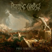
Prologue - Redeemer Of Souls was the only nightmare from prist after that are coming only good ones
3.
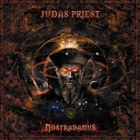
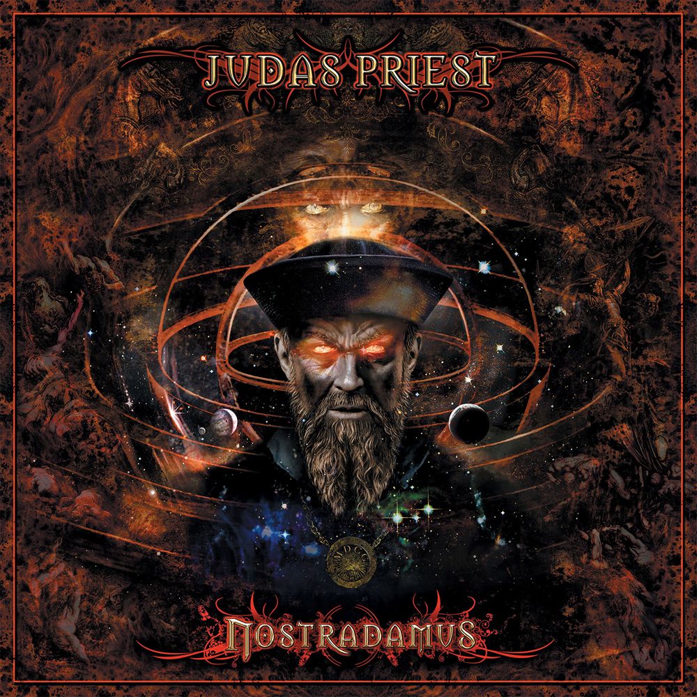
Judas Priest - Nostradamus I guess the problem is.. that it's just looks like very conceptual album i mean way way way concept,I don't want to see priest so much emhh.. (¬‿¬ ) Progressive? I do not know which word to choose. I don't know, cover is good and nothing exacly wrong with that but when you think about JB this is not about this ╮( ˘ 、 ˘ )╭
4.
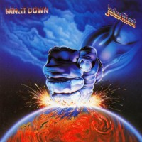
Judas Priest - Ram It Down nice cartoony but somehow it's felt a bit too treacly/cheesy ¯\_(ツ)_/¯
5.
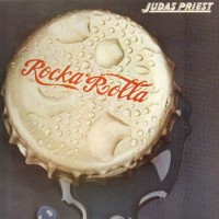
Judas Priest - Rocka Rolla it looks fresh and interesting, this band has not yet known what and how it will sound in the future and it's intriguing :) nothing wrong with this one
6.
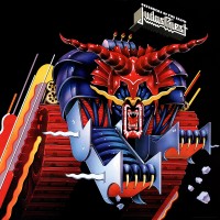
Judas Priest - Defenders Of The Faith Super tricky one! if you do not look closely, it looks cool but if you look closely..it looks ultra weird and these horns my lord... also the background is very static and font color so lame a mean super grey and lifeless, the fan version of this album looks more angrier and more dynamic, but it still looks cool from afar(Black Sabbath Effect) ⊂( ̄▽ ̄)⊃
7.
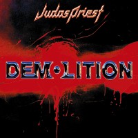
Judas Priest - Demolition 🤘 i like minimalism, there is nothing superfluous and all the lines, colors are followed (◕‿◕)
Judas Priest - Angel Of Retribution 🤘 Hell Yeah! Judas is Rising! \m/( ̄▽ ̄)\m/ that's how comeback should looks like, everything is perfect only it seems to me that it was possible to make it more charismatic or make a less emphasis on details but he is too good,there are some small questions about the font but thats little things
10.
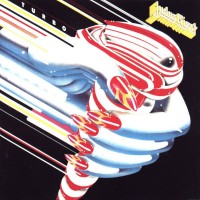
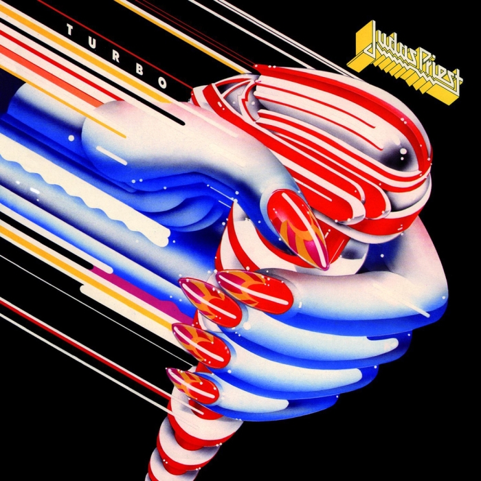
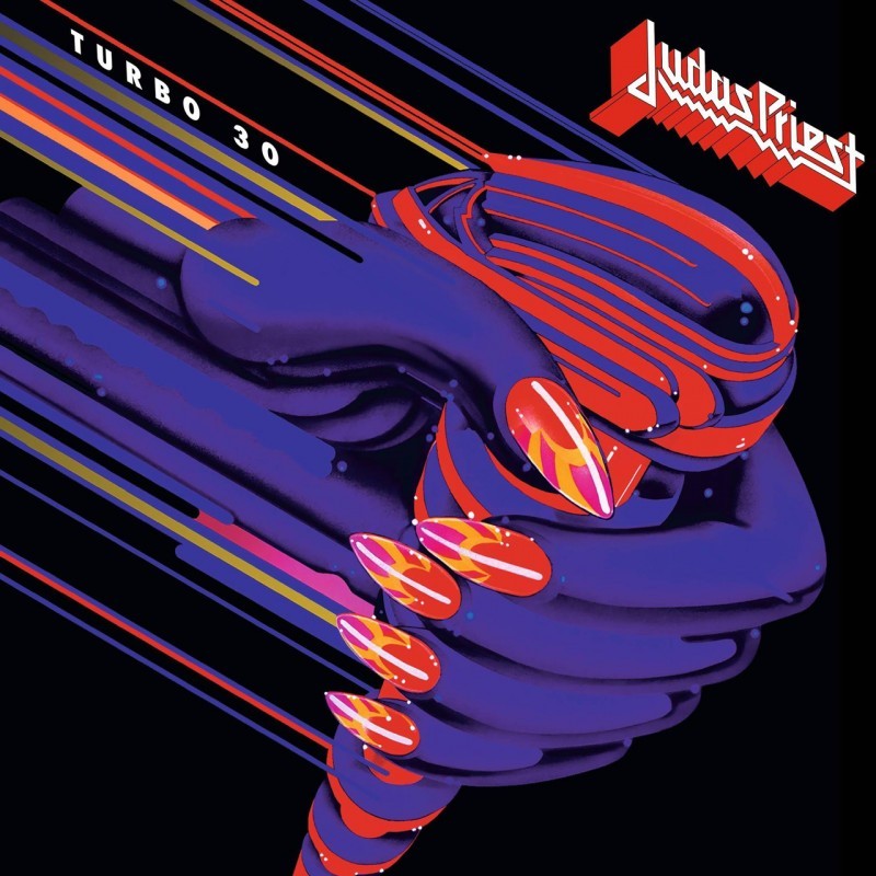
Judas Priest - Turbo MAN! (⌒_⌒;) I Love purple version of this cover i don't care about white one (it will be bottom)
11.
Prologue - After this point, choosing albums is overly difficult. all killer no filler masterpieces ⊂( ´ ▽ ' )⊃
12.
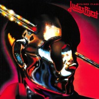
Judas Priest - Sin After Sin why not higher? hmm.. maybe because it looks a bit raw and the lower part looks incredibly gray and dark(can be a good thing,all revolves around the mood) ok ok fuck it! still a 🤘
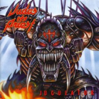
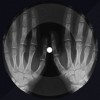
Judas Priest - Jugulator 🤘 Large version is so good as well "bring closer" version too ,when it seems to you that a monster is flying on a hot lava from a river on a surferboard(it always seemed so) you understand that it will be heavy fucking metal ,the original version they chose adds more dynamics and anger and this fucking awesome also,can't even choose which one is better (spoiler) both ♡\( ̄▽ ̄)/♡
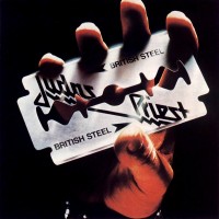
Judas Priest - British Steel 🤘 Hey! if you don't know the words of this song you can turn the fuck around and walk on home Living? ... Rocking? ... Loving? hell yeah ,fucking Trademark of all Prist ♡( ◡‿◡ )\m/
18.
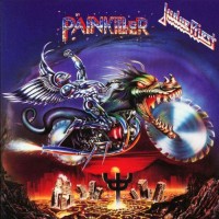
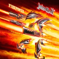
Judas Priest - Firepower 🤘 what? (⊙_⊙) higher than painkiller? (^0^)ノ are you kidding me? ლ(¯ロ¯"ლ) aaaargh man dunno! ╮( ˘ 、 ˘ )╭, this is a 99.9% novelty effect + that I saw a painkiller 1 millions times + Firepower just rules, and i still can't choose it and it just doesn't really matter he get "🤘" so hell yeah
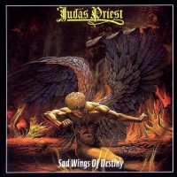
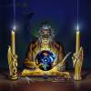
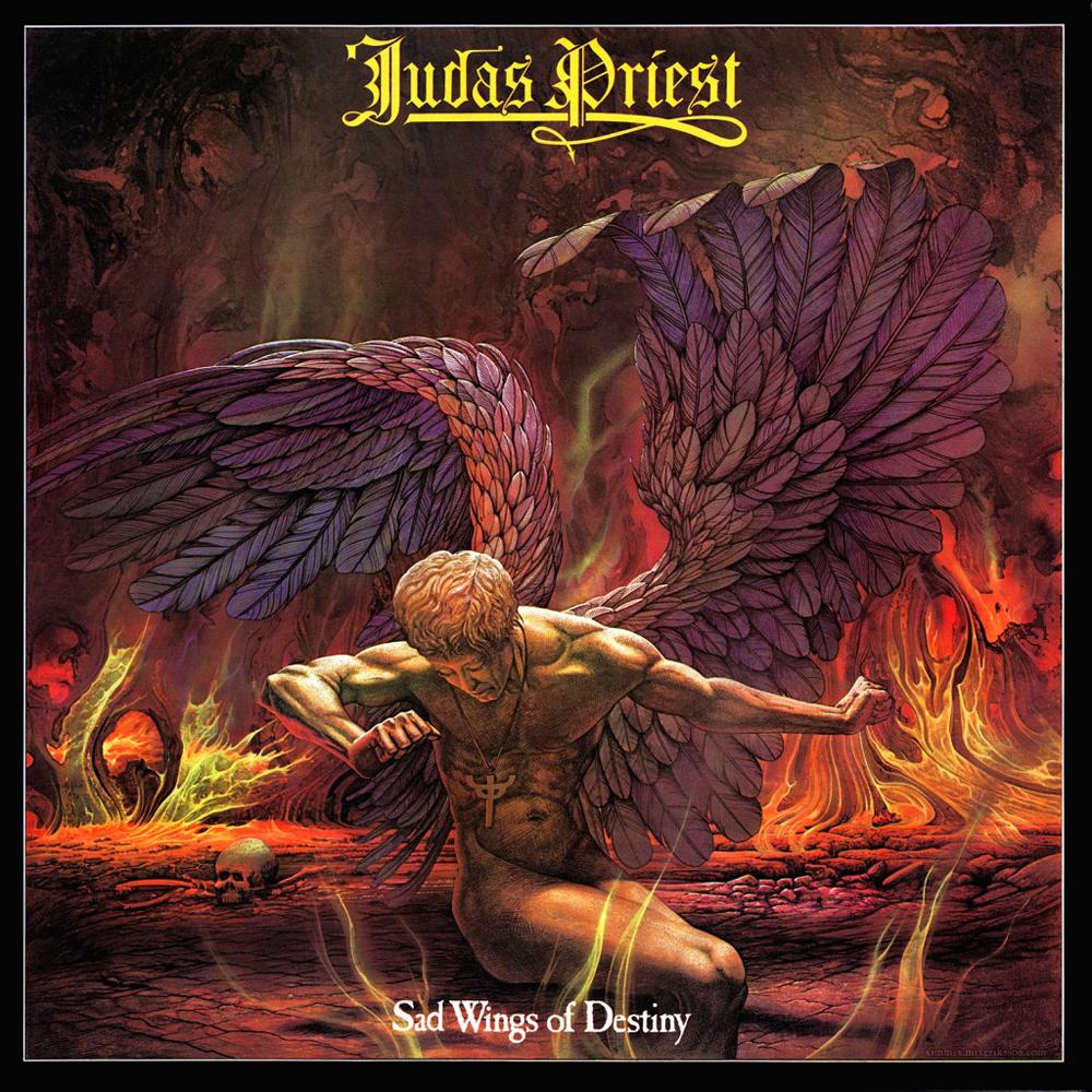
Judas Priest - Sad Wings Of Destiny 🤘 🔥🔥🔥 so why exactly did he take first place? tough to say.. probably he gathered in himself all the qualities in one it's shy,gorgeous,quiet,loud,gloomy,burning,mysterious,evil and knightly in one and the same time ♡
Disclaimer: All top lists are unofficial and do not represent the point of view of the MS Staff.
[ More lists by christmas.inHell ]
Cmon, Defenders Of The Faith is under Demolition, Point Of Entry and Turbo ?
Turbo has an excuse(yeah yeah,very glam but still cute), and Demo/PointOE quite simple they are difficult to rate(it saves them)
and since the Defenders has a little flaw he is in the right place (imo) he is worse than Angel Of Retribution but better those below him but what about first spot? do you like Redeemer Of Souls?
I think the Hero,Hero is my favorite. I never understood what Stained Class was about. Rocka Rolla is a lame pun. Sin After Sin looks ok but doesn't make much sense. I don't know what Point Of Entry is supposed to be either.
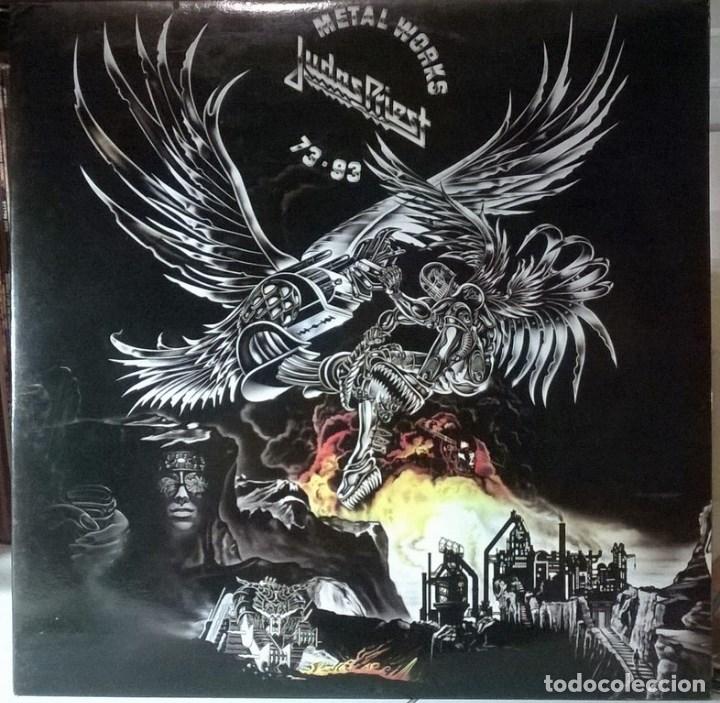
METALWORKS
SAD WINGS OF DESTINY
love this one
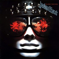
KILLING MACHINE
this one really has a cool concept I think, they nailed the cyborg/biker/bountyhunter aesthetics
UNLEASHED IN THE EAST (backcover)
I really like the attitude they had at that time, them leatherboys
BRITISH STEEL
nice concept, mmh could have looked better
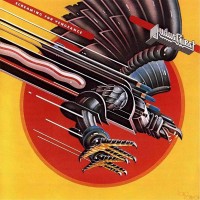
SCREAMING FOR VENGEANCE
SCREAMING FOR VENGEANCE (reissue)
DEFENDERS OF THE FAITH
I don't understand what's wrong about this one, it looks gorgeous to me, I like the sharpness of the colors. Maybe the muzzle looks flat
TURBO
the concept seems stupid to me. It kinda looks cool though. The purple version looks better as you said.
TURBO (purple)
PAINKILLER
really one the coolest one, great design and composition and colors and all
JUGULATOR
from afar it looks correct, but the more you zoom the less it does, what are those strange fingers ?
ANGEL OF RETRIBUTION
very nice one
NOSTRADAMUS
ugly photoshop ?
REDEEMER OF SOULS
ulgier photoshop ? The flames are bothering me. Also the fireball that he throws with a wrong angle. Everything seems off. Like the soundmixing by the way. But also it looks like a shiny yu-gi-oh card
Only thing I find strange is you mentioning the colours on Redeemer Of Souls. That's actually the most common colour scheme you can pick. Orange and teal. That is the most common colour scheme used in film (there are reasons for that like orange fitting really well with skin colour and blue/teal being the contrasting colour to orange).
That said, I'm not a huge fan of that cover either. It looks off for some reason. There are only a couple artwork pieces that I think are exceptional.
Sad Wings Of Destiny, Jugulator are the only ones that really stand out for me. Though I really like Painkiller and Firepower as well.
While metal is obviously mostly about the actual music, I also find that cover art plays a vital role. The artwork sets the mood and encapsulates the emotions of the music visually.
Of course there are exceptions where it seems like the band couldn't care less about their cover art (most fitting examples off the top of my head are Metallica's black album and Black Sabbath's Master of Reality). But when there is effort put into the music as well as the cover art, for me, it just makes the overall experience so much better!
Thanks for making this list - I liked your comments to each. Defenders of the Faith looks weird up close, but that adds to the charm )


 https://pp.userapi.com/c841327/v841327097/58ce9/8U_5tFeaa-s.jpg
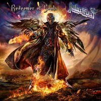


 My first list on MS
 ?
?
 but what about first spot? do you like Redeemer Of Souls?


 by flooding the shoutbox with clickbaiting spam was a good idea?
 i did it for the memes


:format(jpeg):mode_rgb():quality(90)/discogs-images/R-2231146-1470737826-5086.jpeg.jpg)