
Favorite band logo
|
Posts: 164
Visited by: 341 users
| wrathchild Staff Posts: 14090  |
10.10.2006 - 17:36
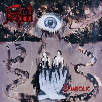
First, please pay special attention to the following rules: - You have to comment on the logo you post and explain why it is your fav; - You should avoid posting large images; - You should remove IMG tags when quoting a logo (replacing them with URL tags would be better); - You should refrain from using images on metal-archives, for they don't show up. Of course, anyone who will ignore those rules will be exposed to sanctions. - - - - - - - - - - - - - - - - - - - - - - - - - One of my favorite band logo is Dream Theater's classic logo, featured on mmost of their releases. I especially like it when colored in yello. It's soft and classy, based on a cool font with some nice alterations of the roman type of font. It's very well integrated to their covers (on Awake or Metropolis part II for example). The "Majesty" symbol is great too though I wouldn't like to see it replacing the "name logo" on a CD cover, for example.  I was extremely worried when they changed logos on Falling Into Infinity, since this other one was... crappy, even though still based on a simple and clear font.
---- La belleza no reside en lo que puedas crear, sino en lo que eres capaz de transmitir Beauty resides not in what you're able to create, but in what you're able to communicate Txus, Mägo De Oz
Loading...
|
| Damnated Churchburner Posts: 4943  |
10.10.2006 - 17:46
is there are an image resizer tag here? or I have to rehost the ones I posted in the previous thread?
---- Blessed is he that murders Christ in himself and in his fellow men.  Written by TheBigRossowski on 10.02.2009 at 16:01
Loading...
|
| Bad English Tage Westerlund Posts: 61156  |
10.10.2006 - 17:51
I dont know if someone it interest but i dont hawe fav band logo, I had seen a lot of band logoes in my life i like mouslly melodic black metal logos and I dont even know all logos what I like for me music are important how band logo I like clasic logoe slike old Amorphis, Emperor, Ulver just now I like simmilar logos how Arcturus but not how wrat post in pic, but in album covers once in old forum I explain what album covers I like(Nature, fantasies, band mambers, stories, farytals....) and for example in Arcturus ''Aspera Hiems Symfonia'' cover band logo mlocks so amazing and simmilar are in Ulver ''Et Eeventyr i 5 Capitler'' but if we take logo whit out cover I dont like it. ok maybe some Guns n Roses logo are great, but not Chi8nese Democracy And ewer day in MA I discovere new bands for example yesteday The Choir Of Vengeance, The Funear Orchestra and Thainius thos eband sare fiew demo and thay are unknow, but play great music but thay hawe no band logo, or if has I will forgot after it if dont get mp3.
---- I stand whit Ukraine and Israel. They have right to defend own citizens. Stormtroopers of Death - ''Speak English or Die''  apos;' apos;'[image] I better die, because I never will learn speek english, so I choose dieing
Loading...
|
| wrathchild Staff Posts: 14090 |
10.10.2006 - 18:17 Written by Damnated on 10.10.2006 at 17:46 If the image is too big, simply write down the URL. Ultra big images are automatically resized but the resized images are still too big considering there could be one image per post in this thread (thus making it slower to load). Basically, I think it's pointless to post a logo that is bigger than what you can see on the actual CD cover.
---- La belleza no reside en lo que puedas crear, sino en lo que eres capaz de transmitir Beauty resides not in what you're able to create, but in what you're able to communicate Txus, Mägo De Oz
Loading...
|
| Paganblood The Aryaputra Posts: 1194  |
16.01.2007 - 13:05  There are many band logos I like and I like most of them simply because they are artistic. I've chosen Vital Remains' logo because, IMO, this logo points out to which 'remains' it calls 'vital'. The lines, circles and alphabets in the logo seem to be symbols used in ancient or medieval times (I think so because similar types of figures are there in ancient Hindu mystic practices as well). I believe some of the symbols(alphabets) there symbolize Greek gods.
---- that which shines without names and forms...
Loading...
|
| Paganblood The Aryaputra Posts: 1194 |
16.01.2007 - 13:07
If I'm wrong in my understanding, someone can correct me.
---- that which shines without names and forms...
Loading...
|
| Dreamwar_86 To Arms! Posts: 480  |
17.01.2007 - 11:51
i also like dream theater logo but my favorite of all is the Edguy one : check it out http://www.live4metal.com/edguy2006Logo.jpg mmmm, i dont understand how we can post it??
---- Stay Metal !!!
Loading...
|
| APOHAKC The Bard Posts: 3585 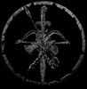 |
17.01.2007 - 18:59
Cradle Of Filth - because it was orginal when they were starting, it is very effective and from that logo you can know what to ezpect from Dani and Co
---- They say that we are gone but I can't let you down The heathen faith will rise again we won't fail now I know we cannot die forever is our time Give my people back to me free from Christianity!!!!
Loading...
|
| chuckie Account deleted |
18.01.2007 - 01:27 chuckie
Account deleted
As said above, Xasthurs logo is reallt fuckin cool lol. I like Satanic Warmaster's logo its got soo much going on in it (dont have a pic of it on hand....)
Loading...
|
| Paganblood The Aryaputra Posts: 1194 |
19.01.2007 - 14:49 Written by spirit_inblack on 18.01.2007 at 00:41 mine too, its artistic too, isn't it!
---- that which shines without names and forms...
Loading...
|
| Daru Jericho Posts: 2098  |
20.01.2007 - 04:30
As stupid as it sounds, I had no idea the Xasthur logo looked like that. That's a damn attractive logo. Favourite logos: Sonata Arctica http://www.nolifetilmetal.com/images/sonata_logo.jpg I love the symmetry and it seems to go well with the music, that smooth yet straight feel. Death http://www.truemetal.org/colombianmetal/specials/death_logo.jpg I really like the positioning of the scythe. This logo differs from a lot of traditional death metal logos and I do think that Death ended up as an original band. Obituary http://www.eternal-terror.com/graphics/logos/logo_obituary.jpg That staff thing in the middle is great, even though it doesn't appear in all their logos. But it's a pretty bold logo overall. Mayhem http://www.bm-addict.com/encyclopedia/norwegian/images/mayhem01_logo.jpg This logo looks somewhat smart as well as reckless. I can't explain but it's absolutely beautfiul. The inverted cross, the bat wings....it's just so pleasing to the eye. Opeth http://www.ilosaarirock.fi/2003/bandit/bandit_images/opeth_logo.gif So beautiful and sinister simultaneously. The intricaies of the 'O' illustrate that same attribute in the music and the rest of the font has that dangerous edge, which was probably more noticable in their earlier work. I might post more if I get the time. And I do hope the damn pictures all show up as I linked them from other places.
---- Aborted Misanthropic Smurf Puppy On Acid.
Loading...
|
| selken Irreligious Posts: 949  |
18.03.2007 - 08:03
My favourite band logo came from Moi Dix Mois, they are a japanese Avant-garde, gothic metal band, the logo is depicted in my avatar image, so, you don't need to look so far... I like it beacuse of its shape, is a circle with a sort of endecagram with a cross in the middle, it has a magic feeling for me, so i've chosen it. <----- <-----
---- 
Loading...
|
| Himann Orm KrigGud Posts: 1859  |
19.03.2007 - 14:09
Mayhem http://www.bm-addict.com/encyclopedia/norwegian/images/mayhem01_logo.jpg I hope Daru Jericho doesn't mind me using her link.. Anyway have always liked the Mayhem logo for its upside down crosses on eaither end and the general look.. Although its a bit more basic compared to what I generally like.. Blut Aus Nord http://www.metalorgie.com/grp_logo/971-logo_Blut_Aus_Nord.png One of the best logos around as far as I'm concerned. I really liked this logo for quite a while. Horna http://www.maelstrom.nu/ezine/img7/hornalogo.jpg Its got similarities to Mayhem's logo but its a lot better in terms of quality and its a lot more complicated and intrinsically designed. Emperor http://www.piercingmetal.com/graphics/logo_emperor.jpg I have always like Emperor's logo. There was a time when I had heard only a few Black Metal bands and Emperor was one of them. At that time it was undoutable the best and I thought it was amazing. Now its a simple font but earlier it was just awesome. I still like it because of those times and what Emperor ment to me then.. Beherit http://upload.wikimedia.org/wikipedia/en/thumb/3/33/Beherit_logo.jpg/200px-Beherit_logo.jpg http://www.sadomator.com/beherit/images/logo01.jpg I like both their logo's although the second one lacts detail. I still like the horns and all in it and the detail on the upside down cross. If the quality were better I would say its one of the best. The newer version has better quality but looks less intrinsic comparatively. Nargaroth http://img.photobucket.com/albums/v114/varathron1/nargaroth_logo.jpg Well this is another favorite.. I like the scythes like stuff on the sides and the central weapons with the font and everything included. Overall very nice and Black Metal like.. Ravensblood http://www.mz.art.pl/promote/Ravensblood_logo.gif Amazing amazing logo. There are two ravens at the begining and the end. There guys are brutal french Black Metal. Very very complicated logo. It took me a while to notice everything in it.. Crossed axes in the back.. Very nice.. Ornaments of Sin http://www.mz.art.pl/interviews/OOS_logo.gif Haha try to read this one. One of the most illegible yet clearly designed logos around. It took me ages to figure out how to read it and I still get confused. Good luck reading this one. I got to hear this band a bit thanks mainly to Sombre Chemin who are another awesome band.. Enslaved http://www.geocities.com/SunsetStrip/Palladium/1747/logo.jpg I found Enslaved's logo quite nice as well although its not that artistic, its got an odd solidness in the way its drawn and forms wolves and stuff at the edges which are rounded rather than sharp.. Its different from typical Black Metal logo's but its quite nice in its own way.. There are lot of logos in this link and a few album covers as well.. Some of them suck and some are ok http://www.lakmus.ru/design/metal.html There are few more which I like but can't remember them all..
---- To be Draped by the Shadow of your Morbid Palace. Ohh, Hate Living...The only heat is warm blood So Pure... So Cold Transilvanian Hunger
Loading...
|
| Rimfrost Posts: 103 |
19.03.2007 - 19:28
Darkthrone easilly, it is so disgusting and rotten. I expect that you all have seen it so I don't post it here.
Loading...
|
| Doc G. Full Grown Hoser Staff Posts: 9718  |
20.03.2007 - 01:16
definitly the Belphegor logo for me, it so gruesome, the two inverted crosses, the text looks like dripping blood, not to mention theres a lot of little details you notice when taking a closer look, like the worm or maggot thingy crawling through the 'O' http://www.into-obscurity.com/images/interviews/belphegor/belphegor.jpg
---- "I got a lot of really good ideas, problem is, most of them suck." - George Carlin
Loading...
|
| FOOCK Nam Posts: 3571  |
21.03.2007 - 14:13
Metal bands logo are all nice, thats why I like all of it. Because too many so I pick one for typically, Children Of Bodom's simple but good enough
Loading...
|
| Oracle Orcinus Posts: 1425  |
17.04.2007 - 04:23
There are heaps of band logos to choose from but i would have to say the best band logo is Falkenbach's. i think it looks mad and i like all the detail on it 
Loading...
|
| Thrash666 Posts: 217  |
17.04.2007 - 08:32
My favorite has got to be Morbid Angel's or the old school Slayer Iron eagle logo. both are awesome
---- LONG LIVE THASH!!!!!!!!! R.I.P. "Dimebag" Darrell Abott Drink a "blacktooth" for Dimebag
Loading...
|
| Sunioj Posts: 3894  |
17.04.2007 - 21:40 I love melecheshs logo, and bloodbaths logo looks badass too!
Loading...
|
| Trifixion Account deleted |
18.04.2007 - 00:07 Trifixion
Account deleted
Not one of my favorites but I think Triste has a very good logo. Very beautiful. http://i100.photobucket.com/albums/m34/xtrifx/triste.jpg Martyr has an awesome logo IMO, although nothing fancy. http://i100.photobucket.com/albums/m34/xtrifx/martyr.jpg Senthil's logo is downright sick. It looks so twisted and I honestly have no idea where the hell there are any letters in there. http://i100.photobucket.com/albums/m34/xtrifx/senth.jpg I also like alot of the ones already mentioneed so I won't post pictures again... Death- Their original logo is classic, it had anything and everything you could want in a classic DM logo. The inverted burning cross, the zombie head, the spiderweb , the sickle, and the whole damn thing is dripping in blood. Classic. And yes I used classic three times. Mayhem- Seriously wicked looking. Perfectly represents Mayhem as a band. Razor sharp, dangerous looking, and of course the crosses. Slayer- Just for levels of kickass they reached with a pentagram made of swords. It's always cool on the eagle too. Cryptopsy- Haha I love their logo, I'm not even sure why. I'll edit if I think of any more.
Loading...
|
| Stalker Lone wanderer Posts: 2705  |
09.05.2007 - 16:40
Psychoparadox logo done by famous Chrisophe Szpajdel.  I like it because its interesting and relatively comlpex, but readable in the same time... Definitely on of my favourites.
---- 
Loading...
|
| Marcel Hubregtse Grumpy Old Fuck Elite Posts: 40071  |
09.05.2007 - 16:50 Written by Stalker on 09.05.2007 at 16:40 and who is this so-called famous mr. Szpajdel. I have neve rheard of him, so my guess is that he isn't that famous.
---- Member of the true crusade against European Flower Metal Yesterday is dead and gone, tomorrow is out of sight Dawn Crosby (r.i.p.) 05.04.1963 - 15.12.1996 
Loading...
|
| Stalker Lone wanderer Posts: 2705 |
09.05.2007 - 17:18 Written by Marcel Hubregtse on 09.05.2007 at 16:50 Well, actually, he's not as famous as his logos... Like for Emperor, Old Man's Child, Borknagar, Enthroned.... and about 100000 more... 
----
Loading...
|
| APOHAKC The Bard Posts: 3585 |
09.05.2007 - 17:21 Written by Stalker on 09.05.2007 at 16:40 God damn Ed, I haven't seen this logo for some time, I remember that I tryed to make Psychoparadox T-Shirt when I was younger but I totaly screwed lol anyway I didn't know that it is Szpajdel's work 
---- They say that we are gone but I can't let you down The heathen faith will rise again we won't fail now I know we cannot die forever is our time Give my people back to me free from Christianity!!!!
Loading...
|
| Marcel Hubregtse Grumpy Old Fuck Elite Posts: 40071 |
09.05.2007 - 17:24 Written by Stalker on 09.05.2007 at 17:18 Aha, thanks for enlightening me. Well, I never delve into who designed the logos....but now I know.
---- Member of the true crusade against European Flower Metal Yesterday is dead and gone, tomorrow is out of sight Dawn Crosby (r.i.p.) 05.04.1963 - 15.12.1996
Loading...
|
| Stalker Lone wanderer Posts: 2705 |
09.05.2007 - 17:57 Written by APOHAKC on 09.05.2007 at 17:21 Yeah, it is....  lol, man, id like to see that t shirt!!! lol, man, id like to see that t shirt!!!  Do you still have it?? I doubt you do.... Do you still have it?? I doubt you do....
----
Loading...
|
| APOHAKC The Bard Posts: 3585 |
09.05.2007 - 18:35
I think I have, it is some old shirt, but I refused to throw it... you'll see, but promise you want laugh 
---- They say that we are gone but I can't let you down The heathen faith will rise again we won't fail now I know we cannot die forever is our time Give my people back to me free from Christianity!!!!
Loading...
|
| BurbotsRevenge Foetal Butchery Posts: 1602  |
03.11.2007 - 10:20
theres some really awesome logos out there but some of my favs: forgotten tomb - the whole spiky vine/dripping vine effect is really awesome!  ensiferum - this logo, sums up folk metal so well, very original and awesome! Songe d'Enfer - pretty unknown band, but freakin awwesome logo!  its just so detailed (without being over-the-top), and looks great! its just so detailed (without being over-the-top), and looks great!
---- Dark death metal from Sydney: https://www.facebook.com/GolgothanRemains
Loading...
|
| +{Jonas}+ I R Serious Cat Posts: 4955  |
03.11.2007 - 18:45
Tool. It's simple yet effective, you can't say much about this logo, it says nothing about the band. http://www.adesgana.com/blog/wp-content/uploads/photos1.blogger.com/blogger/3016/1971/400/tool.jpg
---- "Nobody wants to be the weird kid, you just end up being the weird kid. You don't know how you ended up getting there" - Rob Zombie http://jonas-bs.deviantart.com My dA, mainly photography, go check it out!
Loading...
|
| Damnated Churchburner Posts: 4943 |
03.11.2007 - 23:38
Glorior Belli. imo one of the very rare logos that truly reflect the band and their music. and more elaborate version :
---- Blessed is he that murders Christ in himself and in his fellow men. Written by TheBigRossowski on 10.02.2009 at 16:01
Loading...
|
